
NT Build Brand Refresh
Modernising a Trusted Brand for the Next Generation
This brand refresh modernised NT Build’s visual identity while preserving the recognition, trust and organisational heritage established over two decades.
Shout by Design was engaged to redevelop the long-standing logo and create a clearer, more contemporary identity. The refreshed brand retains a connection to the construction industry while better communicating NT Build’s role as a professional, government-backed statutory authority.
The Challenge
NT Build administers the Portable Long Service Leave Scheme for the Northern Territory construction industry under the Construction Industry Long Service Leave and Benefits Act 2005.
The organisation’s original logo had been in use for approximately 20 years. While it was well established and recognisable, its industrial styling often led people to assume that NT Build was a construction company rather than a government-established authority.
An explanatory tagline had been added over time to help clarify the organisation’s purpose, but this highlighted the need for a more cohesive identity that could communicate NT Build’s role more clearly.
The challenge was to modernise the brand without losing the familiarity and recognition associated with the existing identity.
Strategy and Creative Approach
Research and Discovery
A comparative review was conducted across Australian portable long service leave authorities to examine naming conventions, visual symbols, colour palettes and overall tone.
The research showed that many authorities used symbols associated with time, progress, protection and assurance to clarify their purpose. Strong blues and teals were also common, reflecting qualities such as trust, stability and professionalism.
These findings provided useful direction for evolving NT Build’s identity while maintaining a clear connection to its sector and government role.
Design Objective
The refreshed identity needed to:
- retain a recognisable link to the construction industry
- clearly differentiate NT Build from a commercial construction company
- reflect its role as a government-backed, worker-focused authority
- communicate trust, protection and professionalism
- appeal to an established workforce as well as younger industry entrants
- remain practical across print, digital, signage, uniforms and merchandise
Creative Direction
The creative direction focused on evolution rather than reinvention.
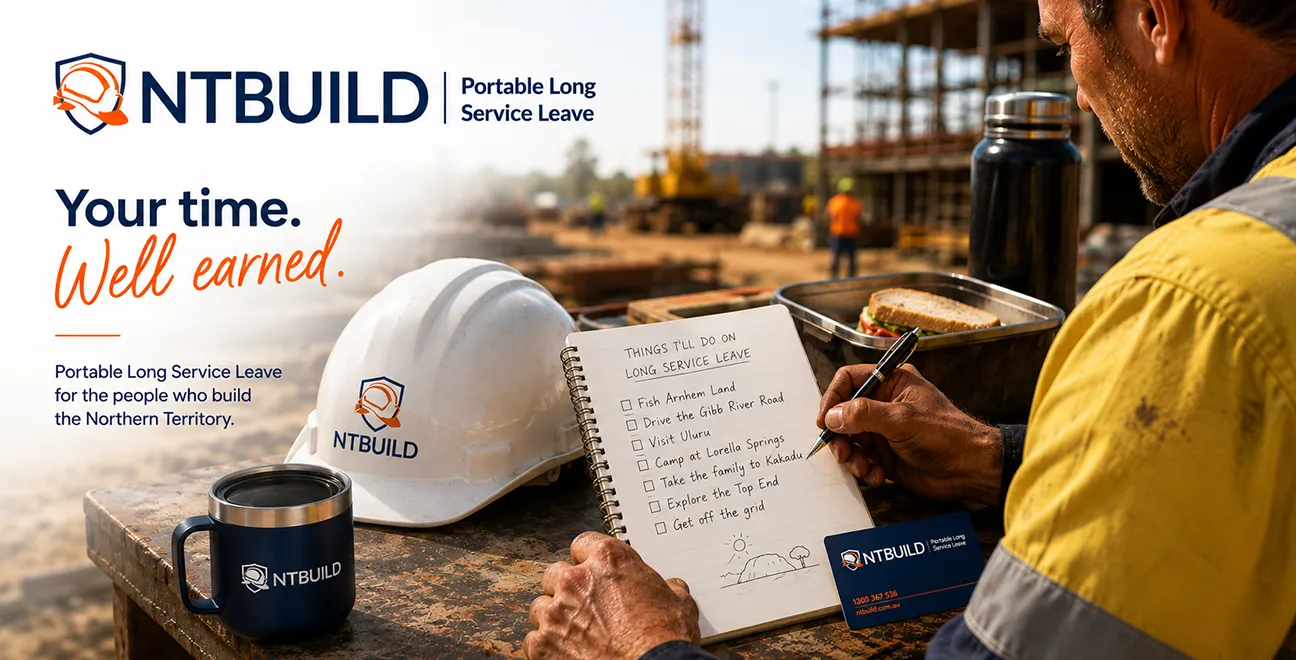
The familiar hard hat symbol was retained but reworked using cleaner geometry and more contemporary styling. A shield form was introduced to reinforce NT Build’s role in protecting and supporting Territory construction workers.
The typography and colour palette were refined to create a clearer, more professional presentation while maintaining continuity with the organisation’s previous identity.
Brand Development
The refreshed logo brings together NT Build’s connection to the construction sector and its role as a trusted statutory authority.
The modernised hard hat and shield symbol communicate protection, service and reliability. Refined typography improves clarity and legibility, while the blue and teal palette reinforces professionalism, stability and public trust.
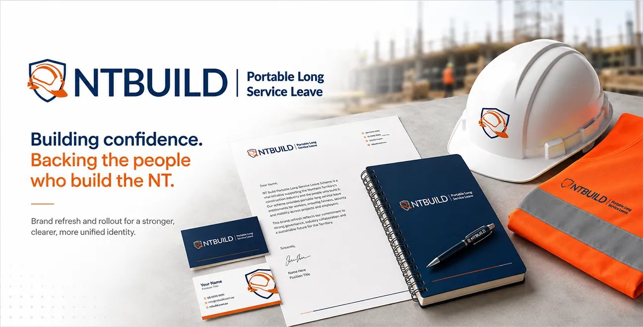
The new identity was designed to remain clear across a wide range of applications, including:
- stationery and corporate documents
- uniforms and safety equipment
- signage and displays
- websites and digital content
- promotional and branded materials
The final system provides NT Build with a flexible and consistent foundation for future communication.
The Outcome
NT Build now has a modern, credible and practical visual identity that better communicates its role while retaining the recognition built over two decades.
The refreshed brand:
- clearly differentiates NT Build from commercial construction businesses
- strengthens its presentation as a government-backed authority
- creates greater consistency across print and digital applications
- aligns more closely with comparable schemes across Australia
- provides a flexible identity for future organisational growth and communication
The result is a brand that respects NT Build’s history while presenting the organisation confidently to the next generation of Territory construction workers.
Services Delivered:
- Brand Strategy
- Logo Design
- Visual Identity Development
Project Type:
Brand and Visual Identity Refresh
Client:
NT Build
Client type:
Statutory Authority
Date:
2025